Node Chart
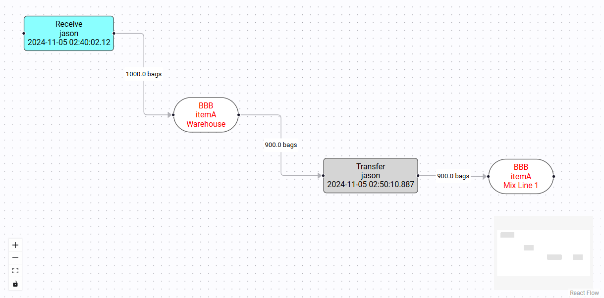
The Node Chart component allows users to organize and visualize data in the form of a diagram with nodes and edges. Nodes can be freely dragged and dropped, and the node chart natively supports zooming in and out, along with panning. Nodes may also display lines of text, and may also have custom styling applied.

Node Chart Properties
The Node Chart is comprised of nodes and edges, with every edge connecting a pair of nodes together.
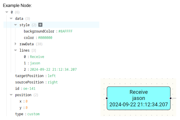
nodes - array of node objects
id (string): unique identifier for the node
position (object):
- x (int): integer value representing the node's x coordinate
- y (int): integer value representing the node's y coordinate
data (object):
- style (object): object of CSS property/value pairs that may change the styling of the node
- lines (array[object]): array of text lines that will be displayed on the node
- text (string): the text of the line
- textStyle (object): object of CSS property/value pairs that may change the styling of the line of text
- rawData (object): optional object that can hold any extraneous data. This object is sent back by the event handlers

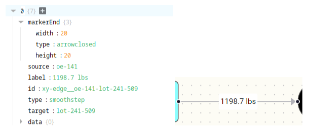
edges - array of edge objects
* type (string): determines the look of the edge, options are: 'default', 'straight', 'step', 'smoothstep', 'simplebezier'
* id (string): unique identifier for the edge. Recommended naming it in a way that references the nodes the edge connects, eg: 'edge_node1-node2'
* *source (string): id of the node that the edge comes from. Must be a valid node 'id'
* target (string): id of the node that the edge goes to. Must be a valid node 'id'
* label (string): text label that is displayed in the middle of the edge
* markerStart (object): optional property that allows for styling of the edge arrow
    * type (string): 'arrow' or 'arrowclosed'
    * height (int): height of the arrow head in pixels
    * width (int): width of the arrow head in pixels
    * color (string): color of the arrow head
* markerEnd (object): optional property that allows for styling of the edge arrow
    * type (string): 'arrow' or 'arrowclosed'
    * height (int): height of the arrow head in pixels
    * width (int): width of the arrow head in pixels
    * color (string): color of the arrow head
* style (object): optional property that allows for styling of the edge line
* labelStyle(object): optional property that allows for styling of the edge label

Node Chart Event Handlers
- onNodeClick - when a node is clicked on
- onNodeDoubleClick - when a node is double-clicked on
- onNodeMouseEnter - when the user's mouse pointer hovers over a node
- onNodeMouseLeave - when the user's mouse pointer hovers out of a node
- onEdgeClick - when an edge is clicked on
- onEdgeDoubleClick - when an edge is double-clicked on
- onEdgeMouseEnter - when the user's mouse pointer hovers over an edge
- onEdgeMouseLeave - when the user's mouse pointer hovers out of an edge
Event Handler Script Example
#    system.perspective.print(event)
    info = event.flowItem.data.rawData
    eventType = event.flowItem.data.type
    traceInfo = {
                    "lotOperationEventId": info['lotOperationEventId'] if eventType == 'operation' else None,
                    "lotId": info['lotId'] if eventType == 'lot' else None,
                    "lotEventId": info['lotEventId'] if eventType == 'edge' else None
                }
    self.view.custom.traceInfo.click = traceInfo
    self.view.custom.traceInfo.info = event

    return