Quality Check Analysis & SPC
The Check Details screen provides detailed analysis of check sheet checks.From here check item data can be charted, tabled, exported and undergo SPC analysis.
Check data can be plotted both horizontally and vertically by clicking on the three dots.
This is purely a preference feature, however large datasets can be handled more readily by switching to the 'Column View'.
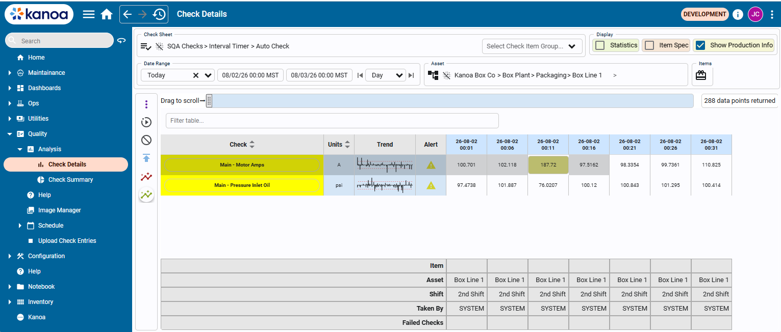
To begin, select a Check Sheet and filter the results by asset and/or item and for a date range. All check data can be displayed in the table or filtered by Check Group. The table view can be configured to show check items as columns or rows, depending on user preference. Displaying check items as columns is faster with large datasets and enables additional analytical measures, such as min, max, average, and standard deviation, that are not available when timestamps are shown as columns. Each timestamp represents an instance when the checks within a check sheet were performed.
The information displayed in the table can be further expanded by enabling the following checkboxes:
- Statistics - Display summary data (Min, Max, Avg, Std Dev, Calc. LCL, Calc. UCL)
- Show Production Info - Include resources as Item, Asset, Shift, etc.
- Show Item Spec - Displays LSL USL if set
 Trend Chart
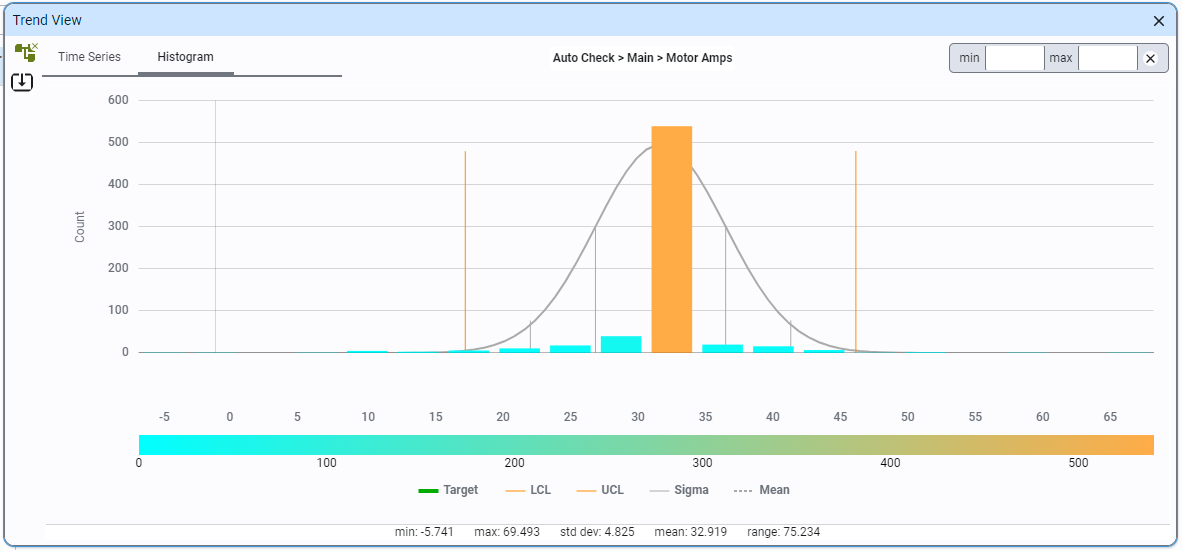
You can trend any check item by selecting it in the table and clicking the icon. The Trend View allows users to analyze data over time through time series or histograms. It also provides the functionality to apply Statistical Process Control (SPC) rules against collected data, helping users understand trends and identify patterns.
The trend view can be viewed by selecting a data point and clicking the 'Trend View' button. Once inside, you can change the trended data point by selecting a different row in the table or using the tree selector.
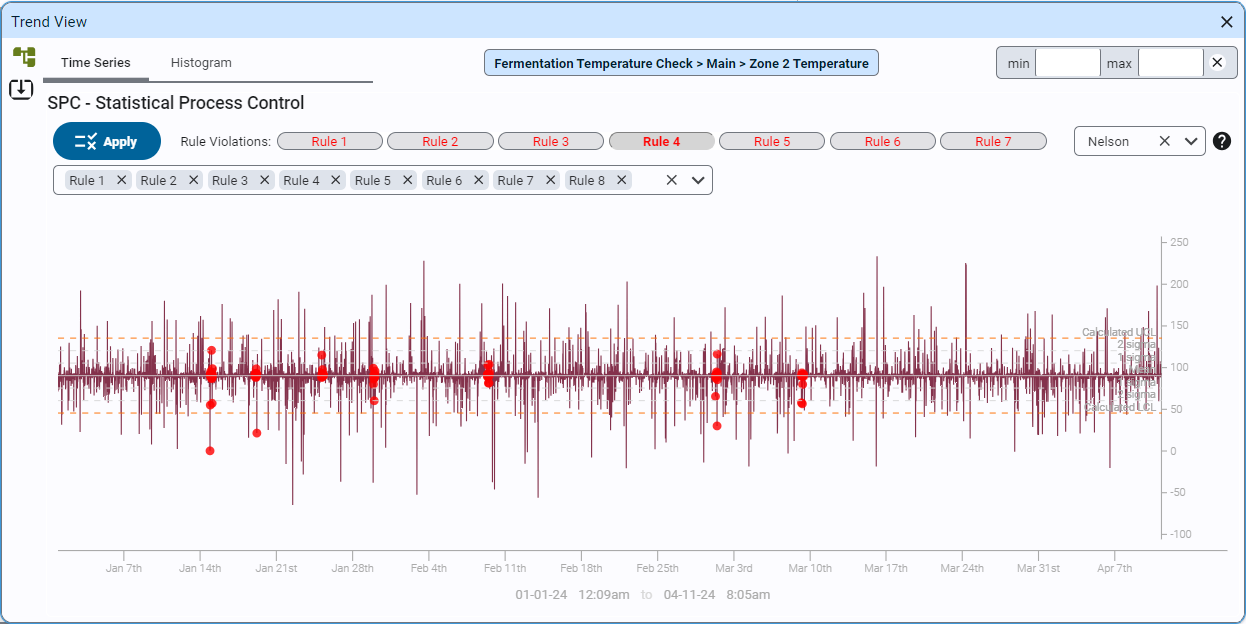
Applying SPC Rules
Nelson and Western Electric SPC rules can be applied to any trend. Rule violations are highlighted on the chart.
Users can export trend data to a CSV file for further analysis.
The charting can be switched between...
- Time Series: Displays a time series chart of the check sheet data, including calculated upper and lower control limits.
- Histogram: Shows a histogram of all collected data, with hover-over functionality for detailed counts in each bar.
- Bar Chart: Shows a Bar Chart of all collected data, with hover-over functionality for detailed counts in each bar.
- Tabular: displays the raw data in a table.
 SPC Control Chart
You can perform SPC analysis on any numeric check item by selecting it in the table and clicking the icon.
The Control Chart screen runs Statistical Process Control against a single check item - individual readings, subgrouped readings, or defect/defective counts - and reads the result as a live control chart. It covers every univariate chart type in one screen: pick a chart type and the screen adapts around it.
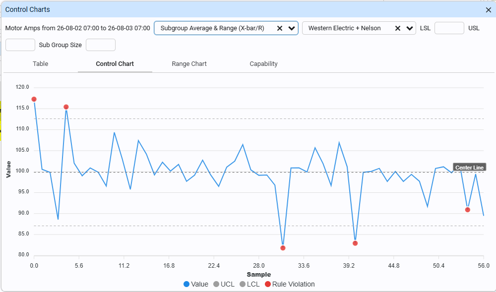
1. Pick a Chart Type
The chart type dropdown lists every supported chart, with a tooltip on each option describing what kind of data it expects:
| Chart type | Data per point | Extra setting needed |
|---|---|---|
| Individual Readings (I-MR) | one continuous value | - |
| Subgroup Average & Range (X-bar/R) | subgroup of 2-10 continuous values | Sub Group Size |
| Subgroup Average & Std Dev (X-bar/S) | subgroup of 2+ continuous values | Sub Group Size |
| Percent Defective (p) | defective count + sample size (varies) | - |
| Number Defective (np) | defective count, fixed sample size | Sub Group Size |
| Number of Defects (c) | defect count, constant opportunity | - |
| Defects per Unit (u) | defect count + sample size (varies) | - |
| Pre-Control | one continuous value | LSL and USL |
Pick the one that matches how the check item was actually recorded - a continuous measurement (individuals/xbar/xbar_s/pre_control), a defective/pass-fail count (p/np), or a count of individual defects where one unit can have more than one (c/u). See the taxonomy in Check Details if you're not sure which family a check item falls into.
2. Choose a rule set (optional)
Western Electric, Nelson, or both. Runs are shown as red points on the Control Chart tab wherever a rule is violated. Leave this blank to just view the chart without automated rule checking. This control is hidden for Pre-Control, which uses its own run/stop signal instead of the Western Electric/Nelson rule engines.
3. Enter spec limits (optional, required for Pre-Control)
Enter LSL and/or USL if you have them. For individuals/xbar/xbar_s, giving one or both spec limits unlocks the Capability tab (Cp/Cpk/Pp/Ppk). Pre-Control requires both to be set - its zones are calculated directly from them.
4. Enter subgroup size (xbar, xbar_s, np only)
Required whenever the chart type groups readings into subgroups, or uses a fixed sample size (np).
- Table tab - the raw values behind the chart.
- Control Chart tab - the main chart: your readings (or subgroup averages) as a line, a Center Line/USL/LSL as a labeled reference line where those are constants, and UCL/LCL as either a reference line or its own series depending on whether the limit is constant or varies point to point (p/u charts with unequal sample sizes need the latter). Rule violations show as red points.
- Secondary tab (individuals/xbar/xbar_s only) - the paired Moving Range/Range/S chart, tracking within-subgroup or point-to-point spread.
- Capability tab (individuals/xbar/xbar_s only, when a spec limit was given) - Cp/Cpk/Pp/Ppk, mean, and both sigma estimates in a table.
- Error message - appears in red next to the settings whenever the current selection can't produce a chart (not enough data, a chart type mismatched to the data, a validation failure like a negative defect count).
 Control Chart (Multivariate T2)
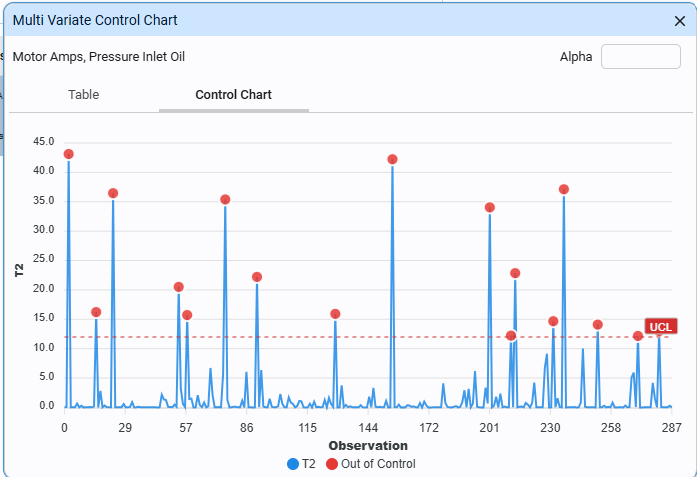
The Control Chart (Multivariate T2) screen charts two or more correlated check items together as a single statistic, instead of watching each one on its own chart. It's built for check items that are physically or causally linked - multiple dimensions on the same part, several readings tied to the same process step - where a shift in the relationship between them matters as much as any one reading drifting on its own.
See Multivariate SPC (Hotelling's T2) for the statistical background - what this screen is actually calculating and why it can catch things a set of individual charts can't.
1. Pick two or more check items
Use the check item picker to select every item you want charted together. They need to be recorded over the same set of observations (e.g. the same inspection events) for the analysis to line them up correctly.
2. Set alpha (optional)
The false-alarm rate for the control limit. Leave it blank for the default, 0.0027, matching the ~3-sigma-equivalent rate used across the rest of this module's control charts.
3. Read the tabs
- Table tab - the raw values, one column per check item, one row per observation.
- Control Chart tab - the T2 value per observation as a line, a single UCL reference line, and any observation that exceeds it marked as a red point. There's no LCL - T2 is an unsigned distance, so there's only ever a "too far from normal" signal.
Reading a violation
A red point means the combination of readings for that observation fell outside what's normal given how the selected check items usually relate to each other - not necessarily that any single reading looked unusual by itself. That's the entire reason to use this screen instead of separate charts per item: two readings that are each individually unremarkable can still be a real signal if they moved together (or apart) in a way that never happens under normal operation.
Statistical Process Control Overview
Process Capability (Cp/Cpk/Pp/Ppk)
Process capability indices measure whether a process, once shown to be in statistical control, is actually capable of consistently producing output within the specification limits (USL/LSL) - they compare the "voice of the process" (how much it naturally varies) against the "voice of the customer" (how much variation the spec tolerates).
Being in control (stable, predictable, no rule violations) and being capable (producing good parts within spec) are two different questions. A perfectly stable process can still be incapable if its natural spread is wider than the tolerance - it will reliably produce a certain percentage of scrap forever, with no special-cause signal ever appearing on the control chart, because that scrap is baked into the process's own normal variation.
- Cp - potential capability: how many times the tolerance width could fit the process's natural spread, assuming perfect centering. Pure spread-vs-tolerance measure; ignores where the process actually sits.
- Cpk -
actual capability: the same idea, penalized for how far off-center the process really is. Cpk is always <= Cp; they're equal only when the process is perfectly centered. - Pp/Ppk - the same two ratios, computed from the total (long-term) variation in the raw data instead of the short-term, within-subgroup variation.
Cp/Cpk use sigma within (short-term) - the same estimator the control chart itself is built from (moving range for individuals, R-bar/d2 for X-bar/R, S-bar/c4 for X-bar/S) - the process's inherent, moment-to-moment variation, with drift or tooling wear averaged out. Pp/Ppk use sigma overall (long-term) - the plain sample standard deviation of every individual reading around the grand mean, folding in everything that happened during the study: drift, shift changes, material lot changes.
The gap between Cpk and Ppk is itself diagnostic: if Cpk is much higher than Ppk, the process is capable moment-to-moment, but something over time (drift, changeovers, material variation) is widening the total spread - a process-control problem, not a fundamental-capability one.
Rule-of-thumb interpretation
- Cpk (or Ppk) < 1.0: not capable - out-of-spec parts even while perfectly in control.
- Cpk = 1.0: just barely fits, matching traditional 3-sigma quality (~0.27% defect rate if centered).
- Cpk = 1.33: a common minimum acceptance threshold in many industries.
- Cpk = 1.67+: often required for safety-critical or automotive-grade parts.
One-sided vs two-sided
If only one spec limit is supplied (e.g. USL only, with no meaningful lower bound - contamination, roughness, etc.), only the corresponding one-sided index is computed (Cpu/Ppu from USL, or Cpl/Ppl from LSL). Cpk/Ppk is always the smaller (worse) of whichever one-sided indices exist.
Why you'd use it
- Turns a subjective "does this look ok" into an objective, comparable number for setting acceptance thresholds and comparing processes/lines/suppliers.
- Separates two different problems: "the process isn't capable" (needs a process/equipment/tooling change) vs. "the process drifted" (needs investigation of a specific cause) - the Cpk-vs-Ppk gap points at which one you're facing.
- Required for many customer/industry quality programs (PPAP, IATF 16949, etc.) as proof a process can hold tolerance before it's approved for production.
Tradeoffs to know
- Meaningless without a stable, in-control process first - computing it on data with active special causes gives a misleading number.
- Assumes a roughly normal distribution - skewed or heavily non-normal data can badly misrepresent the true out-of-spec rate.
- Not meaningful for attribute charts (p/np/c/u) or Pre-Control - there's no within-subgroup sigma to build it from, and Pre-Control deliberately skips sigma estimation entirely.
How it's implemented here
Computed only when usl/lsl are supplied, and only for individuals/xbar/xbar_s. Returned as result['capability'] = {cp, cpk, cpu, cpl, pp, ppk, ppu, ppl, mean, sigmaWithin, sigmaOverall}. cp/pp are None unless both usl and lsl are given; cpk/ppk are the min() of whichever one-sided indices exist.
Pre-Control
Pre-Control is a simplified, spec-limit-based process monitoring method - an alternative to a traditional Shewhart control chart (individuals, X-bar/R, etc.). Where a Shewhart chart derives its control limits statistically from the process's own historical variation (mean +/- 3 sigma), Pre-Control ignores the process's own variation entirely and instead divides the customer/engineering tolerance (USL to LSL) itself into color-coded zones:
- Green zone - the middle 50% of the tolerance band, centered between USL and LSL.
- Yellow zones - the two 25% bands flanking green, from the edge of green out to USL on one side and LSL on the other.
- Red zone - outside USL or LSL entirely (out of spec).
Because the zones come directly from the spec limits rather than from a calculated sigma, there's no historical baseline data to collect and no control-limit math to run before you can start using it - if you know the tolerance, you can set it up immediately.
Use Pre-Control when...
- No statistics background required. Operators read colors and follow a run/stop rule - there's no sigma, no control limit formula, no chart interpretation training needed.
- Answers the question that actually matters for scrap. A process can be perfectly "in control" on a Shewhart chart (stable relative to its own history) while still producing defective parts, if its natural variation is wider than the tolerance. Pre-Control ties the signal directly to the spec limits, so it answers "are we making good parts" rather than "has this process drifted from its own average."
- No baseline data needed to start. Useful for new processes, short/setup runs, low-volume or job-shop work - anywhere you don't have (or don't want to wait for) enough historical data to calculate reliable control limits.
The tradeoff is....
- Less statistically sensitive. Because it isn't based on the process's actual variation, Pre-Control is slower to catch a subtle shift that hasn't yet pushed a reading into yellow or red - a Shewhart chart with tight control limits can flag that same shift much earlier.
- Assumes the process is already reasonably centered and capable. A process whose natural spread is wide relative to the tolerance will trigger yellow/red constantly even when nothing has actually changed - Pre-Control isn't a substitute for having an adequately capable process to begin with.
- No capability indices. Cp/Cpk/Pp/Ppk require a sigma estimate, and Pre-Control deliberately doesn't calculate one - so
_preControlCheck()in this codebase never returns acapabilityblock, unlike the sigma-based chart types.
How It Works
1. Qualification. Before trusting the process, run it and check five consecutive units. All five have to land in the green zone before the process is considered "qualified" and monitoring switches over to the normal sampling rule below. This is the process's way of proving it's centered and capable enough for Pre-Control to be meaningful in the first place.
2. Ongoing monitoring, in pairs. Once qualified, sample two consecutive units at a set interval and read the pair together:
| Both readings | Signal |
|---|---|
| Both green | Keep running |
| One green, one yellow | Keep running |
| Both yellow, same side | Stop - the process has likely shifted; adjust and re-qualify |
| Either one red | Stop immediately - out-of-spec product is being made |
The two-both-yellow-on-the-same-side case is the key signal Pre-Control is built around: two consecutive units both drifting toward the same spec limit is a much stronger sign of a real shift than one yellow reading alone, which could just be normal scatter.
Call system.kanoa.quality.spc.spcCheck() with chartType set to 'pre-control. Requires both usl and lsl
Note this returns a differently-shaped result than when called for the sigma-based chart types: zones/pairSignals/qualifyRunIndex/greenLow/greenHigh/yellowLow/yellowHigh
Univariate SPC (Shewhart Control Charts)
Univariate SPC charts one process characteristic over time, using control limits calculated from the process's own historical variation - not from customer spec limits (that's Pre-Control) and not from a correlated set of variables charted together (that's Multivariate/T2). This is the traditional Shewhart control chart approach, and it's the foundation nearly everything else in this module is built on.
The chart plots a series of points around a center line (the process average), with upper and lower control limits set at roughly +/-3 standard deviations. Because those limits come from the data itself, this answers a specific question: "is this process behaving the same way it always has, or has something changed?" - not "is this process making good parts" (capability) and not "is this within spec" (Pre-Control).
Continuous data - a real measured value (a dimension, a weight, a temperature):
- individuals (I-MR) - one reading per unit, no subgrouping. Simplest case, works with n=1 samples. Uses the moving range between consecutive points to estimate sigma.
- xbar (X-bar/R) - readings collected in subgroups of 2-10; charts the subgroup average, paired with a Range chart tracking within-subgroup spread. Capped at subgroup size 10 because the R-bar/d2 sigma estimator only has tabulated constants for that range.
- xbar_s (X-bar/S) - same idea as xbar, but uses subgroup standard deviation instead of range, and works for any subgroup size >= 2 (not capped at 10), at the cost of a slightly more involved sigma estimator (the c4 bias-correction constant).
Attribute (count) data - counting occurrences rather than measuring a continuous value:
- p (percent defective) - fraction of defective units per subgroup; sample size can vary subgroup to subgroup.
- np (number defective) - count of defective units per subgroup; sample size fixed.
- c (number of defects) - count of individual defects per inspection unit; constant area of opportunity.
- u (defects per unit) - count of individual defects; area of opportunity/sample size can vary.
The distinction between defective (p/np - a unit either passes or fails) and defect (c/u - a single unit can carry more than one distinct defect) is what determines which pair applies.
Use these control charts...
- Detects a process shift or the onset of a special cause as early as possible, using the process's own statistical behavior as the baseline - it doesn't need a spec limit to work (unlike Pre-Control), so it can flag a problem long before any part is actually out of tolerance.
- The rule engines (WE/Nelson) catch subtle non-random patterns - a slow drift, a sudden variance change - that a simple "still inside the limits" check would miss entirely.
- The natural first step toward measuring capability: Cp/Cpk/Pp/Ppk are built directly on top of the same sigma estimate the control chart itself uses.
The tradeoff is...
- Needs enough historical data to calculate a trustworthy sigma - too few points, and the control limits themselves are unreliable, undermining every signal built on top of them.
- Being "in control" doesn't mean the process is capable of making good parts - that's a separate question (see Process Capability); a stable process with limits wider than the tolerance will keep producing scrap and never trip a control-chart signal.
- Subgrouped charts (xbar/xbar_s) rely on rational subgrouping - subgroups need to be formed so within-subgroup variation genuinely reflects only common-cause noise, with anything of real interest showing up as between-subgroup variation instead.
- Getting subgrouping wrong (mixing multiple shifts or machines into one subgroup, for example) can hide the exact shifts you're trying to detect.
How it works
- A center line and control limits are calculated from the sigma estimator appropriate to the chart type (moving range, R-bar/d2, S-bar/c4 for continuous data; binomial or Poisson variance formulas for attribute data).
- Points beyond the control limits are an immediate signal.
- Beyond simple limit-crossing, this module runs the Western Electric and/or Nelson rule sets against every chart - these catch non-random patterns that never actually cross a control limit but are still statistically implausible under normal operation: runs of points on one side of the mean, trends, points hugging the center line too tightly, and similar zone-based patterns. Both rule sets operate generically over per-point sigma zones, so the same rule engine works whether the limits are constant (individuals, xbar) or vary point to point (p/u with changing sample sizes).
Call system.kanoa.quality.spc.spcCheck()
Returns points, mean, pointSigma, uclPoints, lclPoints, secondary (the paired Moving-Range/Range/S chart, continuous types only),
and violations (a dict of rule id -> violating point indices, only populated when ruleSet is given - pass None to skip rule-checking entirely).
Multivariate SPC (Hotelling's T2)
Hotelling's T2 charts multiple correlated variables at once as a single combined statistic, instead of charting each dimension/measurement independently - it captures how far a whole set of measurements, taken together, has drifted from their normal joint relationship.
Independent univariate charts can each look perfectly in control while the relationship between the variables has broken down. Two dimensions on the same part might normally move together (both driven by the same tool wear or material batch) - a reading where each value individually falls within its own normal range, but the pair falls in a direction that never happens under normal operation, is invisible to two side-by-side individuals charts. That's exactly what T2 is built to catch.
Use multivariate to....
- Catch correlation breakdowns that univariate charts on the same variables can't see individually.
- Reduce both the number of charts to watch and the compounding false-alarm rate that comes from monitoring several separate charts at once - one combined T2 chart keeps the overall false-alarm rate at the single rate you set.
- Well suited to check items that are physically or causally linked - multiple dimensions on the same part, multiple readings from the same sensor or process step.
Tradeoff is...
- Needs at least as many observations as variables, plus one, to even compute a covariance matrix - and reliable estimates typically need considerably more than that bare minimum. With a small baseline sample, a single large swing in one variable can inflate its estimated spread enough to mask other genuine outliers.
- A singular (or near-singular) covariance matrix - two perfectly correlated variables, or one that's constant - can't be inverted; the chart can't be built until that's resolved.
- When T2 signals out of control, it doesn't by itself say which variable drove it - that typically needs a follow-up decomposition step, not part of this implementation.
- Phase I only: the baseline recalculates from whatever data is currently charted rather than a separately-validated reference period - appropriate for an evolving process, but the control limit itself will shift somewhat as more data comes in.
How it works
- A baseline mean vector and covariance matrix are computed from the observations being charted (Phase I - there's no separately locked reference baseline; the data defines its own normal).
- For each observation, T2 measures its distance from that mean vector, accounting for correlation between the variables (a plain straight-line distance would over- or under-weight directions the data doesn't normally vary in).
- The UCL is set via a chi-square approximation at your chosen alpha (false-alarm rate), with degrees of freedom equal to the number of variables charted.
- T2 has no LCL - it's an unsigned distance, so there's only ever a "too far from normal" signal, never a "too close to normal" one.
Call system.kanoa.quality.spc.spcCheckT2()
Takes one row per observation (each row holding the same set of variables in the same order) and returns chartType, error, p (variable count), n (observation count),
mean, covariance, points (T2 value per observation), ucl, aboveUCL (violating indices), outOfControl.
Both variableNames and alpha are required parameters - pass None for the defaults (auto-generated Var1..Varp names,
and alpha 0.0027 matching the ~3-sigma-equivalent rate used elsewhere in this module)
SQL Stored Procedures
| Procedure | Purpose |
|---|---|
| qds.spGetAttributeChartData | p/np/c/u chart data — defect count + sample size read directly off measCount/measNumber on the same event row |
| qds.spGetMultiVariateChartData | T2 chart data — pivots N chkItemPaths (comma-separated) into one wide row per takenDate, one column per check item |