Breadcrumb
The Breadcrumb component renders a hierarchical navigation path. It accepts a tree of nodes and tracks which prefix of that tree is currently selected, displaying it as a horizontal crumb trail. A trailing dropdown allows the user to navigate forward from the current position by selecting from the current node's children. Clicking any crumb in the trail navigates back to that level.
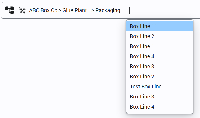
Properties
| Name | Description | Property Type |
|---|---|---|
| items | The full breadcrumb hierarchy, defined as a flat array of top-level nodes. Each node may declare children representing the next level down. The component tracks which prefix of this tree is the active path and builds the trailing dropdown from the current node's children (or from the top-level items when nothing is selected yet). See BreadcrumbNode Properties below. | array |
| selectedPath | The currently selected path as a /-delimited string of node IDs from root to the current node (e.g. home/reports/q1). Readable at runtime and writable to programmatically set the active path. | string |
| selectedData | The data payload of the currently selected node. Mirrors the value sent back by onPathChange. | any |
| separator | Configuration for the icon rendered between crumbs. Defaults to a chevron. See Separator Properties below. | object |
| style | Style applied to the breadcrumb's root <nav> container. | style |
| listStyle | Style applied to the <ol> list wrapper containing all breadcrumb items. | style |
| itemStyle | Style applied to each <li> item, wrapping both the crumb button and its forward-navigation dropdown trigger. | style |
| ellipsisStyle | Style applied to the ellipsis indicator shown in place of a crumb's label when that node is collapsed. | style |
| dropdownTriggerStyle | Style applied to the button that opens the forward-navigation dropdown. | style |
| dropdownContentStyle | Style applied to the dropdown panel listing forward-navigation options. | style |
| dropdownItemStyle | Style applied to each entry within the forward-navigation dropdown. | style |
BreadcrumbNode Properties
Each node in the items array (and within any node's children) supports the following properties.
| Name | Description | Property Type |
|---|---|---|
| id | A stable identifier for the node, used as its key and included in selectedPath. Falls back to the node's position in the list if omitted. | string |
| label | The display text for the crumb and dropdown entry. | string |
| disabled | When true, prevents the node from being clicked without hiding it. | boolean |
| data | A freeform payload (object, array, string, number, or boolean) that is round-tripped back to scripts via onPathChange and written to selectedData when the node is selected. Useful for passing a record ID or entity type. | any |
| collapsed | Breaks the path into ellipsis, best used with long paths to reserve space | boolean |
| children | An array of child BreadcrumbNode objects reachable from this node. Offered in the trailing dropdown once this node is the last selected crumb. | array |
| style | Per-node style override for this crumb's button, layered on top of the shared itemStyle. | style |
Example items array:
[
  {
    "id": "home",
    "label": "Home",
    "data": {},
    "children": [
      {
        "id": "reports",
        "label": "Reports",
        "data": { "section": "reports" },
        "children": [
          {
            "id": "q1",
            "label": "Q1 2026",
            "data": { "period": "2026-Q1" },
            "children": []
          }
        ]
      },
      {
        "id": "archive",
        "label": "Archive",
        "disabled": true,
        "data": {},
        "children": []
      }
    ]
  }
]
Separator Properties
| Name | Description | Property Type |
|---|---|---|
| type | Whether to use the default chevron separator or a custom icon. Options: default, custom. | string |
| icon | The icon to use when type is custom. Accepts an icon path in the Perspective icon format. | string |
| size | The pixel size of the custom icon when type is custom. Default is 14. | number |
| style | Style applied to the separator's icon wrapper element. | style |
Component Events
onPathChange
Triggered when the user clicks a crumb in the trail (navigating back) or selects an item from the forward-navigation dropdown (navigating forward).
| Property | Type | Description |
|---|---|---|
| event.path | array | The full selected path after this change, as an array of node objects from root to the newly selected node. |
| event.selectedPath | string | The same path flattened to a /-delimited string of node IDs (e.g. home/reports/q1). Mirrors the value written back to the selectedPath property. |
| event.selectedData | any | The data payload of the clicked node, or null if the node has none. Mirrors the value written back to selectedData. |
| event.node | object | The specific node that was clicked or picked from the dropdown to produce this path change. |